3 Common Mistakes When Drawing People
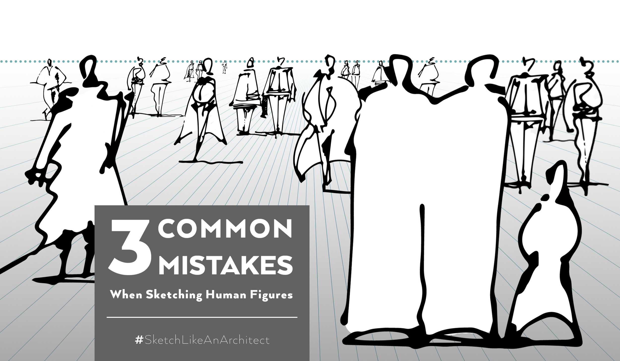
Very often we make these same mistakes when it comes to drawing people in our sketched compositions. Let's break them down and see how to quickly fix them!
In today’s blog, we’re following up on the previous blog post with a downloadable Worksheet for practicing and Freebies related to sketching Human Figures. Here are some more tips on how to make your sketched populated scenes look even better!
COMMON MISTAKE #01: Wrong perspective
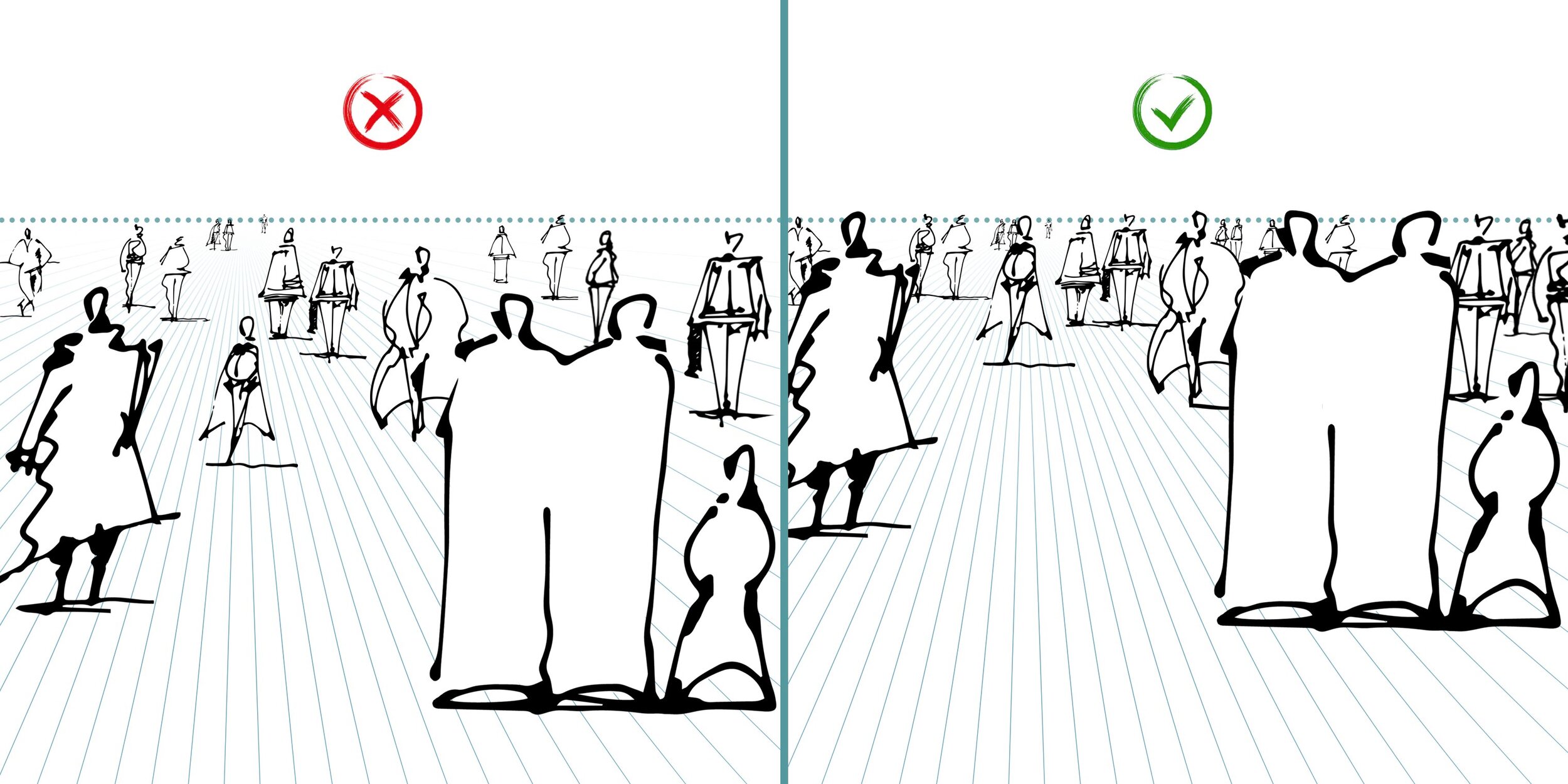
Solution: For eye-level perspective (from a standing human's point of view), place all the standing people's heads on the horizon line. This is applicable also for other cases, when the horizon line is lower then at natural eye-level. Then it should always cut through all the figures in the same place - be it elbows, waist, knees, etc.
As with every rule, here are exceptions, too - children and sitting people will be naturally positioned lower. Another exception is in the case where there are multiple height levels in our scene - in case of ramps, staircases and similar.
Tip: In an eye-level perspective, place all the standing people's heads on the horizon line.
COMMON MISTAKE #02: Scale is off
Solution: By scale here, I mean relative size of one object to another. You already know that a human figure can determine scale of our scene as it's relatable for us and we can easily compare it to other objects in the scene.
On the left hand side you can see an example from a student from my online course. The mistake is in making one storey (floor) the same height as a human figure. This results in the depicted space looking too small or human figures looking too big.
The correct example on the right hand side uses a general rule of thumb, making a storey (floor) the same height as 2 human figures, which is a more realistic approximation (considering a human height 1,75m and a storey height 3,5m).
Tip: Start your sketched composition by referring to a human figure to determine the scale of all other objects in your scene.
COMMON MISTAKE #03: Unnatural placement
Solution: When placing human figures across your scene, try to group people together instead of drawing just a bunch of individuals. In that way, your scene will look more natural as people are social beings and tend to create small groups or couples. Nobody wants to feel left out ;)
Tip: Create a better sense of depth in your image by overlapping human figures and working with 3 depth planes - foreground, middle ground, and background.
Hope you've found this at least a bit helpful and will avoid these mistakes in the future ;)
Happy sketching,
David
#SketchLikeAnArchitect
Never miss another blog post!
Join 30,000+ readers and get updates on new blog posts, freebies, educational resources, and more! No spam. Spam sucks!